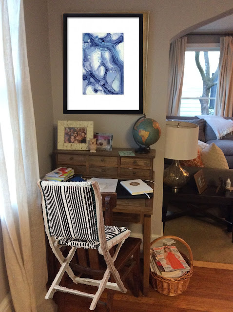
On Tuesday, you might have read Part One of the Modern Eclectic Mix featuring this home's den. Now it's time for the big living room reveal! As with the den, this project was not a full installation. This client want me to create some cohesion between the pieces in not only her living room but also her den and dining room. All three rooms were painted the same color, which helped, but the overall color palette needed some tweaking and the room needed a little lightening and brightening. Here is the living room before I got started...
We kept the rug and most of the furniture but again moved out the end tables and swapped the entryway table for a table that had been a tv stand in the den. We swapped out all of the artwork except for the giant fish, which helped me build a foundation for the color palette. This couple also loves the ocean and surfing and their interest along with the pattern in the rug made me think of waves and movement. I tried to bring in that overall theme with the new pieces we purchased. Here are the concepts I presented.
Just about everything in these boards is now in the living room! The only thing we scratched was the wall sconces. We decided to see how the room shaped up without them first and then see if we needed them. I'm so glad we did because I don't think anyone misses them now that the room is complete. We also did buy that gorgeous velvet ottoman, which was truly stunning in person, but we sent it back because it just never really found its home in the room. Now for the big reveal!!!


As you can see, the color palette in this room is essentially an intensified version of the den's with more pattern mixing and playfulness. The dark teal blues, natural linens and grays really pull the two rooms together. We replaced the end tables (and record player!) with tall metal shelves, which provided more storage and display space. I used pieces my clients already owned to style the shelves and only had to buy one vase- the black and white geometric one- to complete the look! Changing out the mirror and entry table made a huuuuuuge difference! The lines of the mirror reiterated the pattern in the rug, pillows and artwork while placing the lamp near the mirror maximized the light in the room. I also brought in a new desk chair and mirror (over the fire place) with the some cool graphic touches to keep the room feeling fresh. To me, the room feels tailored with a little bit of funk and a lot of personality. If you've been reading this blog for a while, then you know I'm all about the mix so this project was one I loved!
I hope you enjoyed this two-part series! You can reach me at lsuggsinteriors@gmail.com if you have any questions. Thanks for reading!


I LOVE it!! Everything looks fantastic! It's amazing how different the rooms looks now, so pulled together and beautiful.
ReplyDelete